Currently Empty: $0.00
Common Canva Mistakes and how to avoid them like a pro

Overview of Canva’s Popularity
In the world of graphic design, Canva has become a household name. Whether you’re a business owner, a social media manager, or just someone looking to create beautiful designs, Canva offers a user-friendly platform that has revolutionized the way people approach design. From social media posts and presentations to business cards and posters, Canva makes it easy for anyone—no matter their design experience—to create professional-quality graphics.
One of the reasons for Canva’s widespread popularity is its accessibility. You don’t need to be a graphic designer to use Canva effectively. With its drag-and-drop interface, thousands of templates, and a vast library of images, fonts, and design elements, it’s a go-to tool for both beginners and professionals. But with this ease of use also comes the temptation to dive in too quickly, which can lead to common design mistakes.
Why Avoiding Mistakes is Crucial for Design Success
Even though Canva makes design simple, it’s still possible to fall into traps that can weaken your final product. Whether it’s using too many elements in a single design, selecting the wrong font combination, or exporting your files in the wrong format, these canva mistakes can take your work from polished and professional to cluttered and amateur.
Avoiding these mistakes is crucial for achieving design success because a well-executed design can communicate your message more clearly, capture your audience’s attention, and ultimately, build your brand’s credibility. On the other hand, poorly designed graphics can confuse your audience, weaken your brand identity, and reduce the effectiveness of your communication.
In this blog, we’ll cover some of the most common mistakes Canva users make and provide practical tips on how to avoid them. Whether you’re a novice or someone with design experience, these insights will help you create designs that stand out for all the right reasons. So, let’s dive into the details and help you master Canva like a pro!
Common Canva Mistakes and How to Avoid Them
Designing with Canva can be a game-changer for both beginners and seasoned designers, but it’s easy to make mistakes that could undermine your work. Here, we’ll dive into two common Canva errors and how to avoid them to create stunning, professional designs.
Mistake 1: Overloading Designs with Too Many Elements
How to Keep Designs Clean and Focused
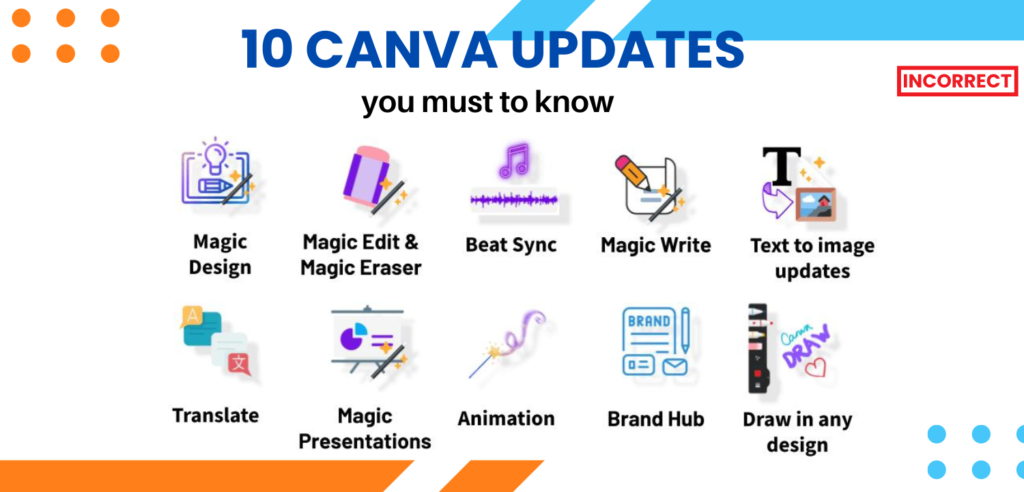
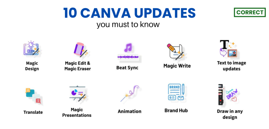
One of the most common pitfalls in design is cluttering your work with too many elements. It might seem tempting to add multiple graphics, text boxes, and colors, thinking it will make your design more engaging. However, an overloaded design can become overwhelming and confusing for viewers.
Tips for Simplifying Your Layout
- Prioritize Key Elements: Start by identifying the most important elements of your design. What message do you want to convey? Focus on these key elements and make them stand out.
- Use White Space Wisely: Don’t be afraid of blank space. White space (or negative space) helps to separate and highlight important components of your design. It can also make your design look more elegant and readable.
- Stick to a Simple Color Palette: Choose a limited color scheme that complements your brand or message. Too many colors can clash and make your design look chaotic.
- Limit Fonts: Use one or two fonts in your design to maintain consistency and coherence. Mixing too many fonts can distract from your message and create visual clutter.
- Utilize Canva’s Layout Tools: Canva offers grid lines and alignment tools to help you arrange elements neatly. Use these features to ensure everything is properly spaced and aligned.
Mistake 2: Using Poor Quality Images
How to Select High-Resolution Images
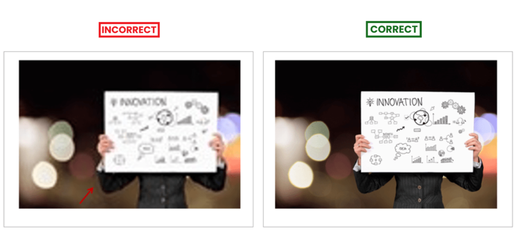
Images are a crucial part of any design, but using poor quality or low-resolution images can detract from your overall presentation. Blurry or pixelated images can make your design look unprofessional.
Tips for Selecting High-Resolution Images
- Choose High-Resolution Files: When selecting images, aim for high-resolution files that are clear and sharp. Look for images that are at least 300 DPI (dots per inch) for print and 72 DPI for web use.
- Use Canva’s Stock Photos: Canva provides a library of high-quality stock photos. Use these images for professional-looking results. You can also filter images by their quality and relevance.
- Optimize Your Images: If you need to resize an image, make sure to do it proportionally to avoid distortion. Canva’s tools can help you crop and adjust images without losing quality.
Tools in Canva to Enhance Image Quality
- Image Enhancer: Canva’s built-in image enhancer can automatically adjust brightness, contrast, and saturation to improve your image quality.
- Filters and Effects: Use Canva’s filters and effects to enhance your images. They can help adjust colors and sharpness to make your images look their best.
- Adjust Image Settings: Fine-tune your image with Canva’s adjustment tools. You can manually adjust brightness, contrast, saturation, and sharpness to achieve the desired look.
- Remove Backgrounds: Canva’s Background Remover tool can help you isolate your subject from the background, making your images cleaner and more professional.
Mistake 3: Not Exporting Correctly
Choosing the Right File Type for Different Uses
Exporting your Canva designs in the correct file type is crucial for maintaining quality and ensuring your designs serve their intended purpose. Here’s a quick guide to choosing the right file type:
- PNG: Ideal for digital use, especially if you need transparency in your design. PNG files preserve image quality and are great for logos and graphics with text.
- PDF: Perfect for print materials such as brochures and flyers. PDFs maintain the design’s quality and layout, making them suitable for professional printing.
- JPEG: Useful for web use when you need a smaller file size. However, it does not support transparency and may lose some quality due to compression.
How to Export Designs with Transparency and High Quality
To ensure your designs are exported with transparency and high quality:
- Select the Right File Type: Choose PNG if you need a transparent background.
- Adjust Quality Settings: In Canva’s export settings, select “High Quality” to ensure your design is crisp and clear.
- Check Transparency: Make sure to select the “Transparent background” option if your design includes transparency.
Mistake 4: Inconsistent Font Choices
How to Create a Cohesive Typography Style
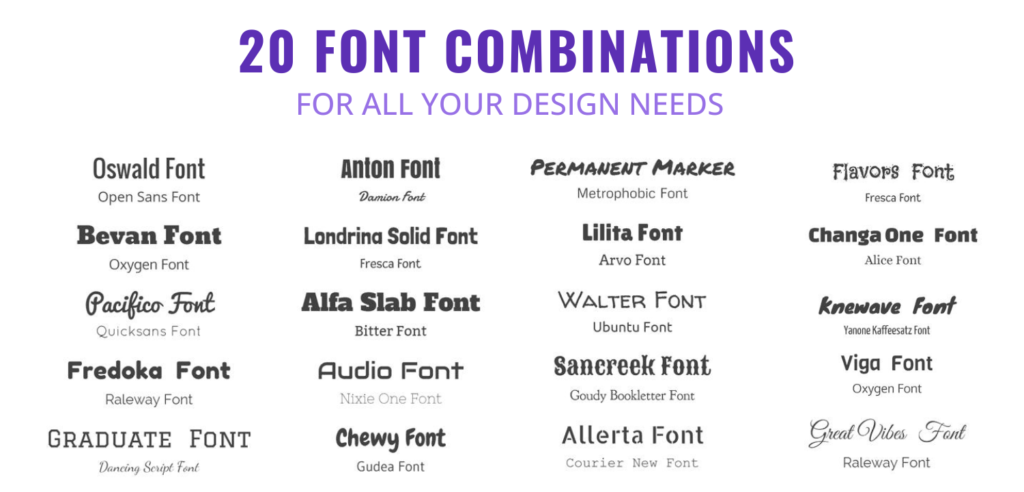
Typography is a key element in design that can either enhance or detract from your message. Using inconsistent fonts can make your design look disorganized and amateurish. To create a cohesive typography style:
- Stick to a Font Pairing: Choose two to three fonts that complement each other. For instance, you might use one font for headings and another for body text. Make sure they work well together and reflect your brand’s personality.
- Establish Hierarchy: Use different font sizes, weights, and styles to establish a visual hierarchy. This helps guide the reader’s eye and makes the text easier to digest. For example, larger, bolder fonts can be used for headings, while smaller, lighter fonts can be used for body text.
Tips for Choosing the Right Fonts for Your Brand
- Match the Tone: Choose fonts that align with your brand’s tone. For a playful brand, opt for whimsical fonts, while a serious brand might benefit from more traditional, clean fonts.
- Ensure Readability: Always prioritize readability. Even the most stylish font is of little use if it’s hard to read. Test your fonts at various sizes and on different backgrounds to ensure they are legible.
By maintaining consistent font choices and pairing them thoughtfully, you’ll create designs that are both visually appealing and easy to read.
Mistake 5: Overusing Canva Templates
How to Customize Templates for Unique Designs
Canva templates are a great starting point, but relying on them without customization can result in generic designs. To make your designs stand out:
- Personalize Templates: Don’t just fill in the blanks—adjust colors, fonts, and layouts to match your brand’s identity. Change images to ones that better represent your message and tweak the text to fit your specific needs.
- Add Unique Elements: Incorporate custom graphics, illustrations, or photos that reflect your brand’s personality. This adds a personal touch and makes your design unique.
Balancing Creativity with Template Efficiency
Templates are designed to save time and provide a framework, but creativity is what makes your design memorable. Here’s how to strike a balance:
- Use Templates as a Starting Point: Begin with a template to get a basic structure, then unleash your creativity. Modify the layout and design elements to reflect your own style.
- Experiment with Design Elements: Play around with different design elements and layouts that go beyond what the template offers. This can help you create something that is both efficient and uniquely yours.
By customizing templates thoughtfully and incorporating your own creative touches, you’ll achieve designs that are both efficient and distinctively yours.
Mistake 6: Forgetting to Use Brand Colors
The Importance of Brand Colors
One of the most common mistakes in Canva design is neglecting to use consistent brand colors. Your brand colors are more than just a visual choice; they play a crucial role in your brand identity. Consistent use of brand colors helps establish a recognizable and cohesive look across all your marketing materials, making your brand more memorable and professional.
How to Set Up a Brand Kit in Canva
Setting up a Brand Kit in Canva is a straightforward process that can save you time and ensure consistency:
- Access Your Brand Kit: In Canva, go to the main dashboard and click on the “Brand Kit” tab on the left sidebar.
- Add Your Brand Colors: Click on the “+” button to add your primary and secondary brand colors. You can enter color hex codes to ensure accuracy.
- Upload Your Brand Fonts: If you have specific fonts for your brand, upload them into the Brand Kit for easy access.
- Save and Apply: Once your Brand Kit is set up, you can apply these colors and fonts to any new design project, ensuring that all your designs stay on brand.
The Impact of Color Consistency on Brand Identity
Color consistency is key to building a strong brand identity. When you use your brand colors consistently, you help create a cohesive visual experience that reinforces your brand’s message and values. It also makes your marketing materials instantly recognizable to your audience, helping to build trust and familiarity.
Mistake 7: Ignoring Alignment and Spacing
The Importance of Consistent Alignment
Alignment and spacing might seem like minor details, but they play a crucial role in the overall effectiveness of your design. When elements are misaligned or spaced unevenly, your design can look chaotic or unprofessional. Proper alignment creates a sense of order and harmony, making your content easier to read and more visually appealing. Consistency in alignment helps guide the viewer’s eye through your design, ensuring that the most important information stands out.

How to Use Canva’s Grid and Guides Effectively
Canva offers built-in tools like grids and guides to help you achieve precise alignment. Here’s how you can use them:
- Grids: Grids are a fantastic way to keep your design elements in check. You can select from various grid layouts depending on your design needs. To add a grid, go to the “Elements” tab, find “Grids,” and choose one that fits your project. This helps in aligning images and text consistently.
- Guides: Guides are invisible lines that you can drag from the rulers on the top and left sides of your Canva workspace. They help you align objects by giving you a visual reference. To add a guide, simply drag from the ruler onto your design. You can place guides at any point to ensure that your elements line up perfectly.
By using these tools, you can avoid the common pitfall of misalignment and create a polished, professional-looking design.
Mistake 8: Neglecting Accessibility in Design
Ensuring Text Contrast and Readability
Designing with accessibility in mind ensures that your content is readable by everyone, including those with visual impairments. Here’s how to improve text contrast and readability:
- Use High Contrast Colors: Ensure that text contrasts well with the background. For example, dark text on a light background or vice versa is easier to read.
- Choose Readable Fonts: Opt for clean, legible fonts and avoid overly decorative styles that might be hard to read.
Designing for All Audiences: Accessibility Features in Canva
Canva offers several features to help make your designs more accessible:
- Accessibility Checker: Use Canva’s built-in tools to check for contrast issues and ensure your text is legible.
- Alt Text: Add descriptive alt text to images, which helps screen readers convey the content to users with visual impairments.
- Legible Fonts: Choose fonts that are easy to read and avoid overly complex styles.
By incorporating these practices, you ensure that your designs are inclusive and accessible to a broader audience, enhancing your brand’s reach and effectiveness.
Mistake 9: Overlooking Copyright and Licensing
When creating designs on Canva, it’s easy to get carried away with the variety of stock images and elements available. However, overlooking copyright and licensing terms can lead to serious issues, including legal trouble. Here’s how you can ensure you’re using Canva’s resources properly and legally:

How to Properly Use Canva’s Stock Images and Elements
Canva offers a vast library of stock photos, illustrations, and design elements. While this is a great resource, it’s crucial to understand that not all images are created equal in terms of usage rights. Here’s what you need to know:
- Check the License: Canva provides two types of licenses for its assets: the Free License and the One-Time Use License. Free assets are available for use in personal and commercial projects, while One-Time Use License assets may require a one-time fee for certain types of use. Always check the specific license details before using an asset.
- Read the Usage Restrictions: Some elements might have restrictions, such as not being used in a logo or as a primary feature of a design. Ensure you’re aware of these limitations to avoid potential copyright issues.
- Avoid Reselling: You cannot use Canva’s elements to create products for resale, like t-shirts or prints, without proper licensing. If you plan to sell products featuring Canva’s assets, make sure you have the right type of license or consider using custom graphics.
Understanding Licensing Terms and Legal Use
Understanding licensing terms is vital for staying within legal boundaries. Here’s a quick guide:
- Personal vs. Commercial Use: Personal use usually means you’re using the design for yourself or as a gift. Commercial use involves using the design to promote or sell something. Canva’s license terms specify what’s allowed for each type of use.
- Attribution: Some free assets may require you to credit the creator. If this is the case, make sure to include the necessary attribution in your design or accompanying materials.
- Content Ownership: Remember that even though you’re using Canva’s resources, the ownership of the design still falls under Canva’s licensing agreements. Always review these terms to understand your rights and limitations.
Mistake 10: Rushing the Design Process
Designing a project might seem straightforward, but rushing through the process can lead to subpar results. Here’s why taking the time to refine your design is crucial and how to ensure your Canva creations are polished:
Why Taking Time to Refine is Important?
- Quality Over Speed: Rushing often results in overlooked details and errors. A well-thought-out design reflects professionalism and attention to detail, which is essential for making a good impression.
- Consistency Matters: When you rush, it’s easy to miss inconsistencies in your design elements, such as fonts, colors, and spacing. Taking your time helps ensure that all elements are aligned and cohesive.
- Error-Free Design: The chance of making typographical or layout errors increases with haste. Properly reviewing and refining your design helps catch and correct these mistakes before finalizing the project.
Steps for Reviewing and Perfecting Your Canva Designs
- Take a Break: After finishing your initial design, step away for a bit. Returning with fresh eyes can help you spot errors or areas for improvement that you might have missed.
- Check Alignment and Spacing: Use Canva’s alignment tools and guides to ensure that all elements are properly spaced and aligned. Consistent spacing and alignment contribute to a more professional look.
- Review for Consistency: Ensure that fonts, colors, and design elements are consistent throughout your project. Consistency helps in creating a unified and aesthetically pleasing design.
- Get Feedback: Share your design with others to get feedback. Sometimes, a second opinion can provide valuable insights and suggestions for improvement.
- Proofread: Carefully proofread all text to avoid typos and grammatical errors. Clear, error-free text is crucial for effective communication.
Conclusion
In conclusion, avoiding common Canva mistakes is crucial for creating professional and polished designs. One of the key areas to be mindful of is copyright and licensing. Understanding how to properly use Canva’s resources, including stock images and design elements, ensures that you stay within legal boundaries and avoid any potential issues. This includes checking licenses, being aware of usage restrictions, and ensuring that you have the appropriate permissions for commercial use.
Equally important is taking the time to refine your designs. Rushing through the design process can lead to inconsistencies, errors, and a lack of cohesion. By dedicating time to review your work, checking for alignment, consistency, and errors, you’ll improve the overall quality of your projects. Getting feedback from others and stepping away from your work before final review can also help you catch mistakes and make necessary improvements.
Mastering Canva involves balancing your creativity with a solid understanding of best practices. By being conscious of copyright issues and giving your designs the attention they deserve, you’ll be well on your way to producing high-quality, standout projects. Keep refining your skills, stay mindful of these common pitfalls, and enjoy the creative process. Happy designing!


